Julie Starr

Fantastic Building Lot Within Walking Distance to Downtown Northampton!

alt tag

Have you been looking for the perfect spot to build a small footprint house within walking distance to downtown Northampton? If so, look no further! 0 Stoddard Street in Northampton is a unique infill lot. It has the required 50 feet of frontage but widens to 65 feet along the back lot line. In addition, the seller is willing to allow a "zero lot line" on the left hand border (from the street). The city's mandated 15 foot side setback would be *softened* up to 10 feet closer to the existing lot line - allowing for more space to build or add a garage. Stoddard Street abuts the bike path, it is steps away from the supermarket, and walking distance to town. While it's proximity to town/bike path allows for a "car lite" lifestyle, Stoddard Street is quiet, lined with quaint houses and lovely gardens. For more information, contact Julie Starr. Offered at $180,000

Spring Garden Clean Up!

alt tag

Can you feel it? Spring has sprung! There's no denying the feeling that a literal dark cloud has lifted, once the days get warmer, the nights get longer, and the beautiful spring flowers start to poke through the soil. Even on a rainy weekend such as this, the warmer temps and lighter skies help buoy the spirits of us

[...]

Smith Bulb Show in Full Swing!

alt tag

Cold temperatures, mounds of snow and ice got you down? Head over to Smith College for the remaining 9 days of the Smith and Mount Holyoke College Spring bulb show. The variety of flowers, array of colors and floral scents, and the recently added corresponding art installation should help lift your spirits and remind you that spring and

[...]

A Case for Bold Colors

alt tag

Generally speaking, when we realtors are called in to advise potential sellers about readying their homes for sale, we generally recommend neutral wall colors over bolder choices. However, as a homeowner, I am a big fan of rich colors. We recently hired local interior design team Workroom Design Studio to assist us in our color and decor choices for a house we are renovating. I would say that our design theme is historically relevant "jewel tones". Our WDS designer, Sally Staub, encouraged me along the way not to be afraid to use rich colors. With a mix of neutrals and jewel tones, the overall feel is welcoming, homey and playful. We couldn't be happier with the results! The following article from Apartment Therapy, also discusses the use of bold color combinations that work together beautifully. Enjoy!

6 Color Combos That Shouldn't Work But Totally Do

Adrienne Breaux
Feb 7, 2019

There are any number of color "rules" you can follow when you're picking out your home's palette. The classic 60-30-10 Rule is a place to start. You can lean on the smart suggestions of a color expert. Those looking to add dark colors in a small space might even want to consult some online guidance. But the six stunning homes in this post prove that you can play around with what some might consider "clashing" color combos and pull it off beautifully.

 
(Image credit: Susie Lowe)

Pink, green, and blue in Emily Murray's kitchen

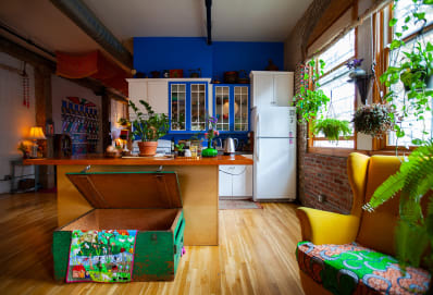
A mossy green comprises a bold chevron pattern emblazoned with tiles on the kitchen backsplash. The cabinetry consists of a dusty blue reminiscent of a foggy sky. A perfectly hued pink makes up the tiles that hug the kitchen island base. How on earth are all of these colors working together in a way that doesn't resemble a baby's nursery? Well they're all quite balanced—each of the three colors show up in roughly the same percentage. But more importantly they all have the same medium, grayish-hued tone. It's not hot pink with an earthy blue and green. There's no neon green screaming the attention away from a pale blue and pink.

Three seating options, three strong colors in Holly Conrad's loft

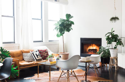
It's not unusual to see one boldly colored sofa in a living room. Sometimes even two. But three different large-scale seating options... in the same room... all a different strong color? How is that working? Well, in this case, all the colors belong to an established, known color "family," called jewel tones. Jewel tones—likely modeled after the rich hues seen in actual jewels—all go together because we've decided as a society they do. Also helping here is the art piece that contains all three main colors, as well as a soft gray-and-white rug that seems to ground the room.

(Image credit: Sylvie Li)
 

Nine or more strong colors in one space, as seen in Cécile Gariépy's apartment 

I spy with my eye at least nine strong different colors in this room photo alone. How can so many disparate hues coexist so peacefully? In this illustrator's home, it's about using a lot of white or negative space, incorporating strong black and white graphic elements as the focal points, and then sprinkling little pops of strong color around the space. I know "pops of color" is a very cliche thing to say these days, but it's stuck around so long because it's a tried and true method of using a lot of different colors while not making your room feel out of control. Like a composition on paper or on the screen, Cécile's sprinkled pops of bold color throughout the room in a visually balanced way, crafting a room that feels calming yet colorful, at the same time.

Four strong colors in less than 300 square feet in Matt's tiny house

"Arsenic" lights up the living room, "India Yellow" is splashed in the kitchen, "Cook's Blue" emboldens the bathroom, and "Red Earth" adds a warm glow to the bedroom. Do you know what all the wall paint colors in Matt's tiny house have in common? They're from the same brand, Farrow and Ball. Does that mean that any time you pick four random colors from the same manufacturer they'll magically go together? I wish. But by going with a high-end, tightly curated company like Farrow and Ball, you decrease your chances of clashing simply since many of the colors flow together nicely. In fact, many paint brands today build their own "themed" color palettes of carefully chosen colors that all "go" together. Start there if you're unsure.

Just going for every color in Chad Burton and Burger Kim's Toronto apartment and Cherub Stewart's New Jersey home


Two different countries, two different styles, and two very different color schemes, yet these two homes have something very important in common—they are going all the way with color and not apologizing for it. I wish I could point to any one "reason" why these two homes—filled with color on the walls, the furnishings, even the floors—work. I think the idea of, "If you're going to go over the top, go way over the top" applies here. The inhabitants didn't dip their design toes into color... there's no small pop of bright color here or there. Every square inch of these spaces is dripping in bold hues, and that's why it works.


Time to Declutter and "Spark Joy"

alt tag

OK, I admit it, I've written about this topic a time or two in the past. The truth is that this is an ongoing issue in my own household. Many of us in the 21st find ourselves surrounded by too much stuff, at a loss for how it got there, and how to (responsibly) dispose of it. In addition, as a realtor and self proclaimed homebody, I know

[...]

Where to Look for Inexpensive and Attractive Home Decor!

alt tag

As someone who is both a realtor (in and out of homes on a regular basis) and is working on a large home improvement project for the second time in 5 years, I can attest to the following list from apartmenttherapy.com as to where are the best places to find inexpensive and attractive home decor. I would add the following local to

[...]
31-40 of 88 Posts